Solutions For Energy Managers

Granular visibility for your facility portfolio

Energy Managers are on the front lines of operational efficiency — managing aging infrastructure, diagnosing waste, and capturing savings. Enpira partners with you to make sure your data is current, your analysis is sound, and your findings are ready to present.

Why Energy Managers Choose Enpira

Professional grade energy management software

You’re managing dozens — sometimes hundreds — of facilities, each with their own meters, rate schedules, and operational quirks. You need data you can trust, analysis you can defend, and a team that helps you uncover savings opportunities. Enpira gives you all three, in a single managed platform.

A blue line-art icon of a desktop computer screen featuring interactive data visualizations, including a three-slice pie chart and a four-bar vertical graph.

All Your Energy Data, In One Place

Electricity, natural gas, water, solar, EV charging, and more. Intuitively compiled, insightfully presented, and always available.

A blue line-art icon featuring a stylized office building with a circular shape containing a wrench, symbolizing building maintenance and recommissioning.

Recommissioning Support

Review your facility commissioning with an in-house energy management expert and prioritize recommissioning initiatives across your portfolio.

A stylized blue piggy bank icon with a dollar sign, representing utility cost reduction and financial savings.

Savings You Can Prove

Quantify savings using industry-standard measurement & verification methodology, or count on Enpira as a trusted third party assessor.

Multiple digital screens, including a laptop and a tablet, displaying colorful energy analytics graphs and data visualizations.

Operational Analysis

Stop reacting, start preventing

The highest-value work an Energy Manager does is catching problems and fixing them quickly. Enpira gives you the high-resolution visibility to pinpoint issues.

A blue line-art icon featuring a horizontal bar graph on the left and a simplified building on the right, representing Energy Use Intensity (EUI) data.

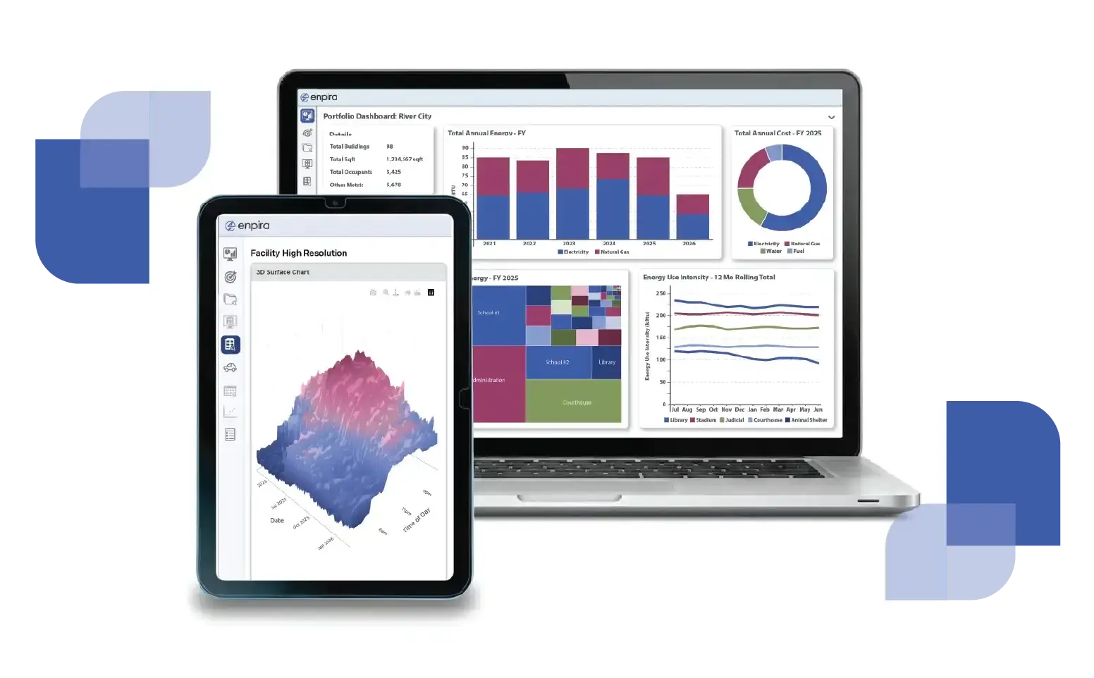
Portfolio Benchmarking
Compare energy use intensity across your entire portfolio by facility type, size, and time period to identify under-performers for your next project.

A stylized blue icon of a fluctuating 3D mesh grid, symbolizing high-resolution interval data and granular energy consumption patterns.

Interval Data Analysis
Use high-resolution interval data analytics to identify exactly when and how energy is being wasted.

A blue line-art icon of a triangle with rounded corners containing a large exclamation mark, representing an alert or notification.

Anomaly & Leak Detection
Automated alerts notify you of anomalous high usage and rising costs, so issues can be addressed promptly.

An energy management dashboard on a computer desktop screen featuring colorful bar charts, donut graphs, and a 3D surface plot for tracking utility performance.

Measurement & Verification

Prove your projects worked, with numbers that hold up

Capital projects are an easier sell with credible savings verification. Enpira uses industry-standard savings verification to quantify the impact of your efficiency investments.

A blue line-art security shield containing a bold white checkmark, representing verification and industry compliance.

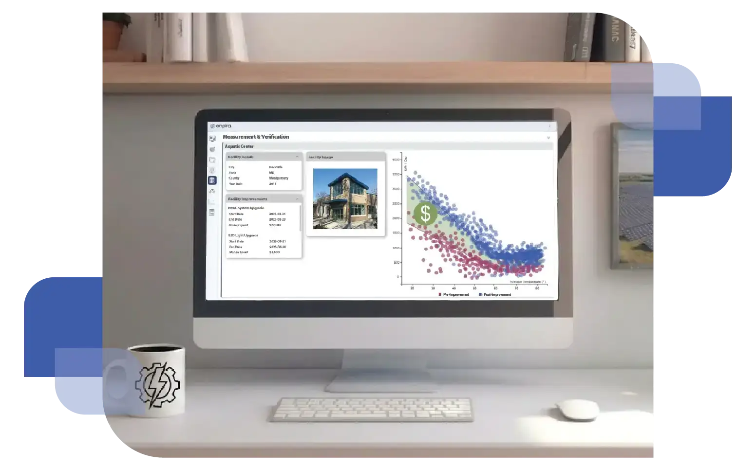
Project Impact Verification
Track the measured savings of capital projects over time using weather-normalized baselines so your reported savings reflect the actual impact of your work.

Blue line-art icon of a document with a dollar sign, a pencil, and a ruler, representing grant writing and reporting.

Savings Reporting Support
Enpira supports performance contracts with ongoing monitoring, and finds additional savings opportunities to help hit targets.

A stylized blue piggy bank icon with a dollar sign, representing utility cost reduction and financial savings.

Utility Rebate Support
As a utility Trade Ally, Enpira helps secure funding for your energy savings initiatives and reports the values of your projects to the utility.

A wooden office desk with a calculator and pen resting on top of a "Monthly Budget" financial document and a computer monitor with a colorful graph representing cost-effective energy planning.

Rate & Bill Management

Make sure you're not leaving money on the table

Utility rates are complex, and available savings are more common than most organizations realize. Enpira monitors your rate schedules, audits your bills, and proactively identifies opportunities to reduce what you’re paying.

A blue line-art icon featuring a computer screen with a bar chart, connected by lines to several circular nodes, representing data flow and system integration.

Multi-Commodity Tracking
Electricity, natural gas, water, and fuel - all tracked in a single platform, with cost breakdowns that make it easy to see where your utility spend is actually going.

A blue line-art icon of a balance scale, with one dollar sign in the left pan and another in the right, representing financial comparison or rate simulation.

Rate Simulation & Optimization
Enpira analyzes your smart meter data to confirm that you are on the most favorable rate — or determine the savings from switching to a better option.

A blue line-art icon featuring a document with a dollar sign and a security shield containing a checkmark in the foreground, representing verified bill auditing.

Bill Auditing & Validation
We cross-check utility bills against actual meter data, catching billing errors and flagging overcharges for recovery.

Let's get into the details together

See how Enpira gives your team the data depth and expert support to manage your portfolio more efficiently — and prove the value of your projects.